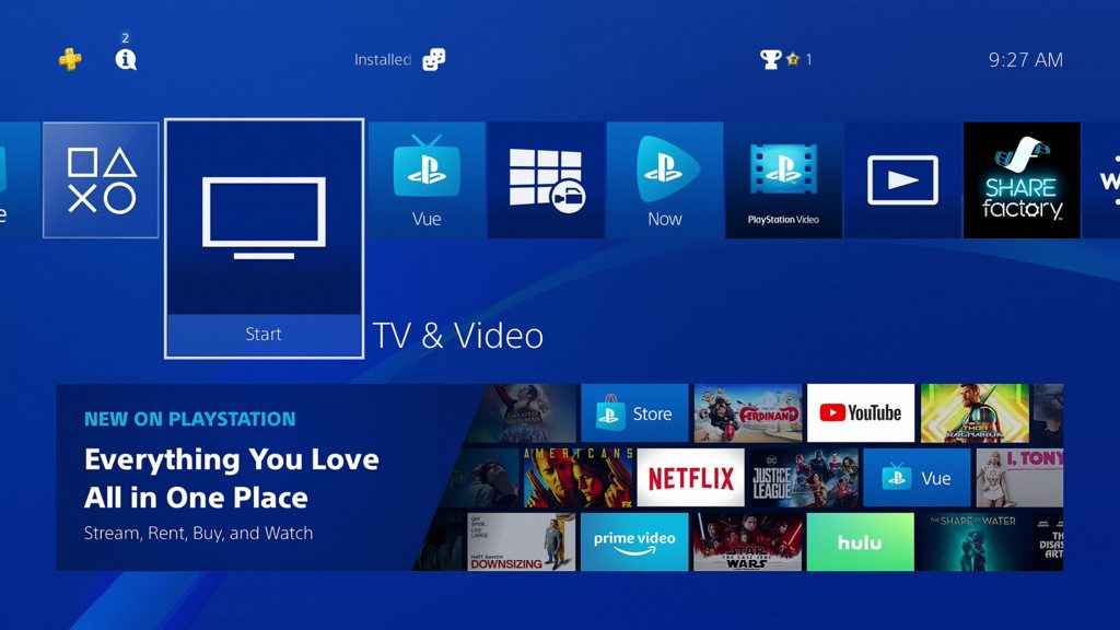
Sony released a revised version of the UI for their TV and Video applications for North America in an attempt to make it easier to use.
It seems some people don’t quite agree with that however.
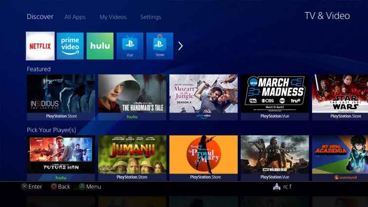
This US update (which falls in line with the EU version a bit more now) alleges to put content front and center, making it easier for you to discover and watch the best movies and TV shows available across your favorite streaming services, such as Netflix, Prime Video, Hulu, and YouTube, in addition to PlayStation Video and PlayStation Vue. The PlayStation Blog listed off a few features of this refresh.
- Browse in one place - You can now find trending content or discover new movies, TV shows, live TV events and user-generated content from your favorite video services in a single place, without jumping in and out of apps. TV & Video is now a central destination for exploring content and easily renting, purchasing, or subscribing to services that give you access to the content you want to watch.
- Featured and Spotlight categories - The ‘Featured' section shows you a mix of the best content from various video services. We also have a ‘Spotlight' section that shows you popular content based on a rotating theme, such as “Superheroes” or “Award Season.”
- Personalized YouTube experience - You can link your YouTube account to your PlayStation Network account to get personalized recommendations in the YouTube section. Personalized recommendations for other services are coming soon too!
- Currently trending live channels on PlayStation Vue - The PlayStation Vue section shows you live channels that are most popular now in your area. PS Vue subscribers get one-click access to the livestreams and the content shown will be tailored to your subscription plan.
- Direct app access - With the updated interface, you still have fast access to the video apps you use most, a full list of all available video services, and your PlayStation Store video library in ‘My Videos.'
Unfortunately, it hasn’t gone down to well, with the major complaint being it just adds more clicks to get to what users want, and that it essentially just advertises services more aggressively. The comments below the post are full of that sentiment, but rather than wade through that, I’ll throw you a few ‘highlights’.
Well so far I hate it. Why does improving things mean always adding extra steps or clicks to get to where you want to go. Why can't things be quick, clean and efficient.
This is genuinely ugly, way too much on screen, I purposely made sure I could do as little scrolling as possible with the current UI, I will not be updating to this or won't be using my ps4 much if I'm forced to use this
This update is garbage. At best, you're now essentially advertising for all of the video providers on your platform. At worst, I'm now subject to what *you* think *I* should watch.
The ironic thing is that I wouldn't mind this specific app if it were an OPTIONAL thing to do. A combination of *installed* apps? Sure, why not? But this is the default and it includes apps we don't use/have installed just so they can advertise to us.
Good lord, now I have to load up an app to load up an app? Some of the personalization features are okay but I just want to be able to hop into Plex or Youtube from the PS4 landing page, why is that not okay?
Of course, there’s also a lot of hysterical nonsense because what would a comments section be without hysterical nonsense? Yet that doesn’t detract from the fact this update hasn’t really done anything to improve the TV and Video section. It certainly does shove apps you don’t have or use in your face for no reason other than to give everyone a ‘fair’ platform. I personally don’t hate it with quite the bubbling disdain many seem to, but I get the gist of their disgruntlement.
How do you feel about the design of the TV and Video section on your PS4? How would you improve it?