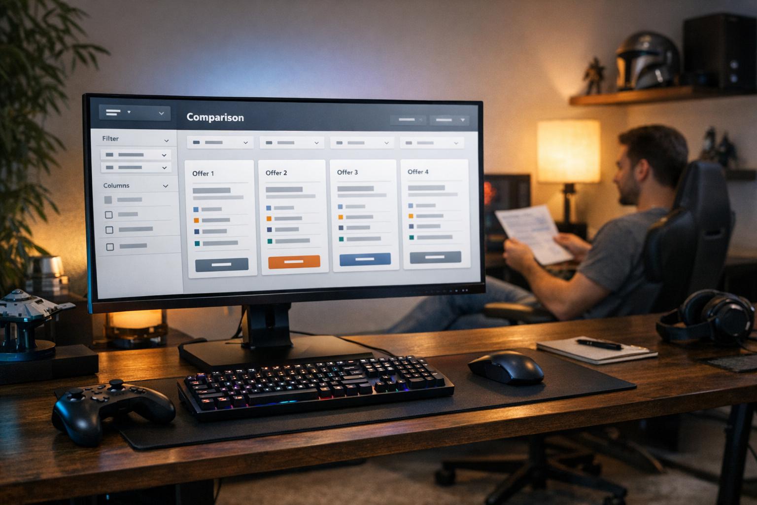
Bonus pages used to feel like a quick scan. Now they often feel like a puzzle, with similar labels and changing rules. Too many tabs can make every offer look alike. That shift is why comparison tools matter more than they once did.
The trend is wider than betting. EMARKETER reported that United States online sales during Prime Day 2026 reached $26.4 billion, up 9.3% year over year. Even so, shoppers became more selective and more likely to comparison shop. Many weighed bargain staples against carefully justified upgrades, and searched for proof of value, not just a sale badge.
When More Offers Mean More Noise
Crowded promo markets create a simple problem. Different offers can look nearly identical, even when the fine print changes the real value. Baymard found that 36% of 343 leading United States and European online retail sites had product list flaws serious enough to hurt product selection. Its research also says the average site still needs 35 design changes to feel easy to use.
Why Bettors Need A Shortcut
Sports betting makes this problem easy to see. A free bet, a deposit match, and a boosted odds offer may sit beside each other, yet each works differently. One may fit a live match, while another only works before kickoff. Without clear sorting, people must open several pages just to decode basic terms.
That extra effort slows decisions and can hide useful offers. For readers comparing markets, pages that gather all betting bonuses make it easier to check rules, states, and expiry dates. A side by side view can also show which offers require a deposit and which do not. The benefit is not more noise, but a faster path to what actually fits.
That matters because shoppers are harder to impress than before. EMARKETER noted that Prime Day discount levels were broadly similar to the previous year. Yet high satisfaction with Amazon’s discounts fell to 59% from 68%. In any crowded offer market, clearer comparisons can beat louder promotion.
Filters Turn Choice Into Progress
Good filters do more than trim a long list. Baymard’s research hub now collects 630 filtering option examples, 520 sorting tool examples, and 82 comparison tool examples, as documented in their filtering examples. That scale suggests comparison design is now standard practice, not a niche extra. People expect help narrowing the field before they commit time.
The best tools also let people combine several values inside one filter type. A reader might want offers for a specific sport, a certain reward type, and a short time window at once. In some cases, a single control that merges sorting and filtering makes the journey simpler. That keeps the search moving instead of resetting with each click.
This matters because different readers define value in different ways. Useful filters should separate reward types, so bonus bets do not mix with deposit offers. They should also sort by timing, so people can separate tonight’s games from longer season promos. Conditions matter too, because minimum odds or play requirements need to stay visible. That structure turns personal priorities into a usable search path.
Good Design Earns Trust Faster
Presentation shapes trust as much as price. When several offers look alike, a side by side view makes the tradeoffs easier to judge. It also matches a wider shift away from tab heavy browsing and toward faster narrowing. People want the answer sooner, not more tabs.
McKinsey has noted that AI tools help compare choices in categories with heavy choice overload, especially fashion. The same logic now reaches other crowded markets. Chat tools often do some sorting before a person even lands on a site. People increasingly expect technology to narrow the options first.
Baymard reports that 24% of shoppers rank loyalty programs as a high priority account feature. It also places loyalty programs as the fourth most important online account feature overall. Rewards still matter, but they need a clear place in the comparison. When benefits sit beside the rules, the offer becomes easier to trust.
Clear layouts should show the headline benefit and the main condition in the same row. Similar offers should align so the real differences stand out quickly. Readers should also be able to sort by value, effort, or time left, depending on the goal.
What Better Comparison Signals Next
Comparison tools are no longer a nice extra for bonus pages. As offers multiply, people want less hunting and more proof that an offer is worth the effort. That mirrors broader shopping behavior across retail, where sales can rise even as trust becomes harder to win. Clear design helps bridge that gap.
The next step is clear. Better filters, cleaner side by side views, and smarter summaries help people decide before frustration sets in. In busy promo markets, the clearest comparison usually gets the attention.